Imperial March: Dorfman and Mattelart’s ‘How to Read Donald Duck’
Ben Schwartz / January 15, 2020
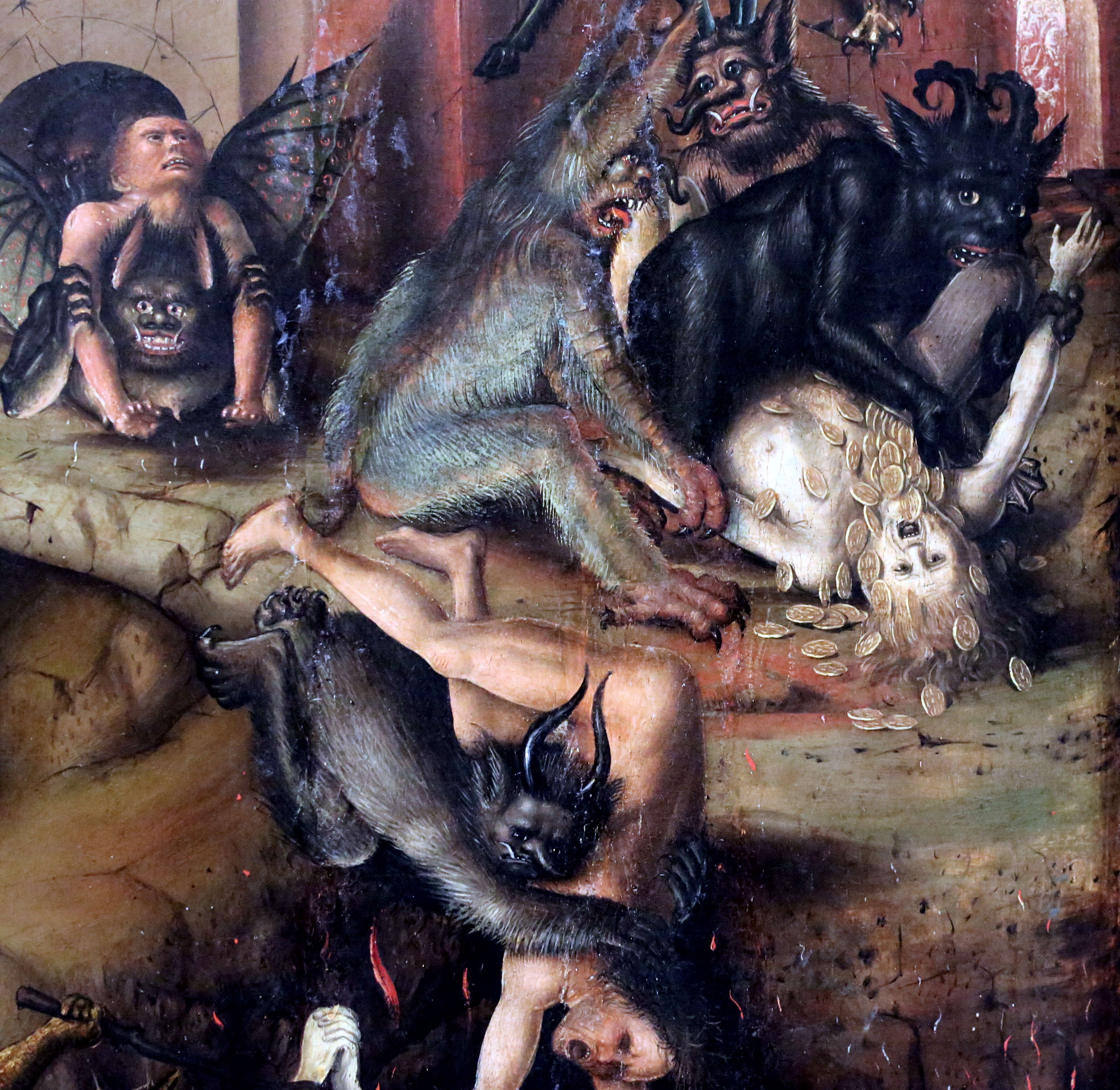
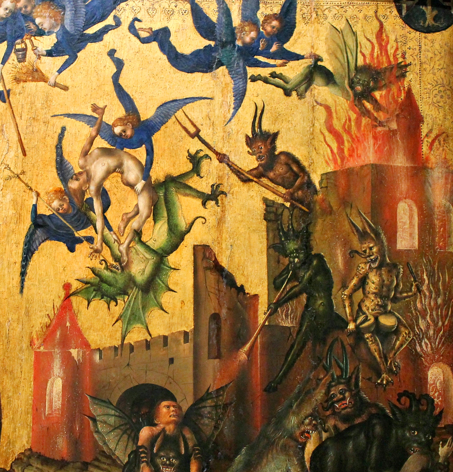
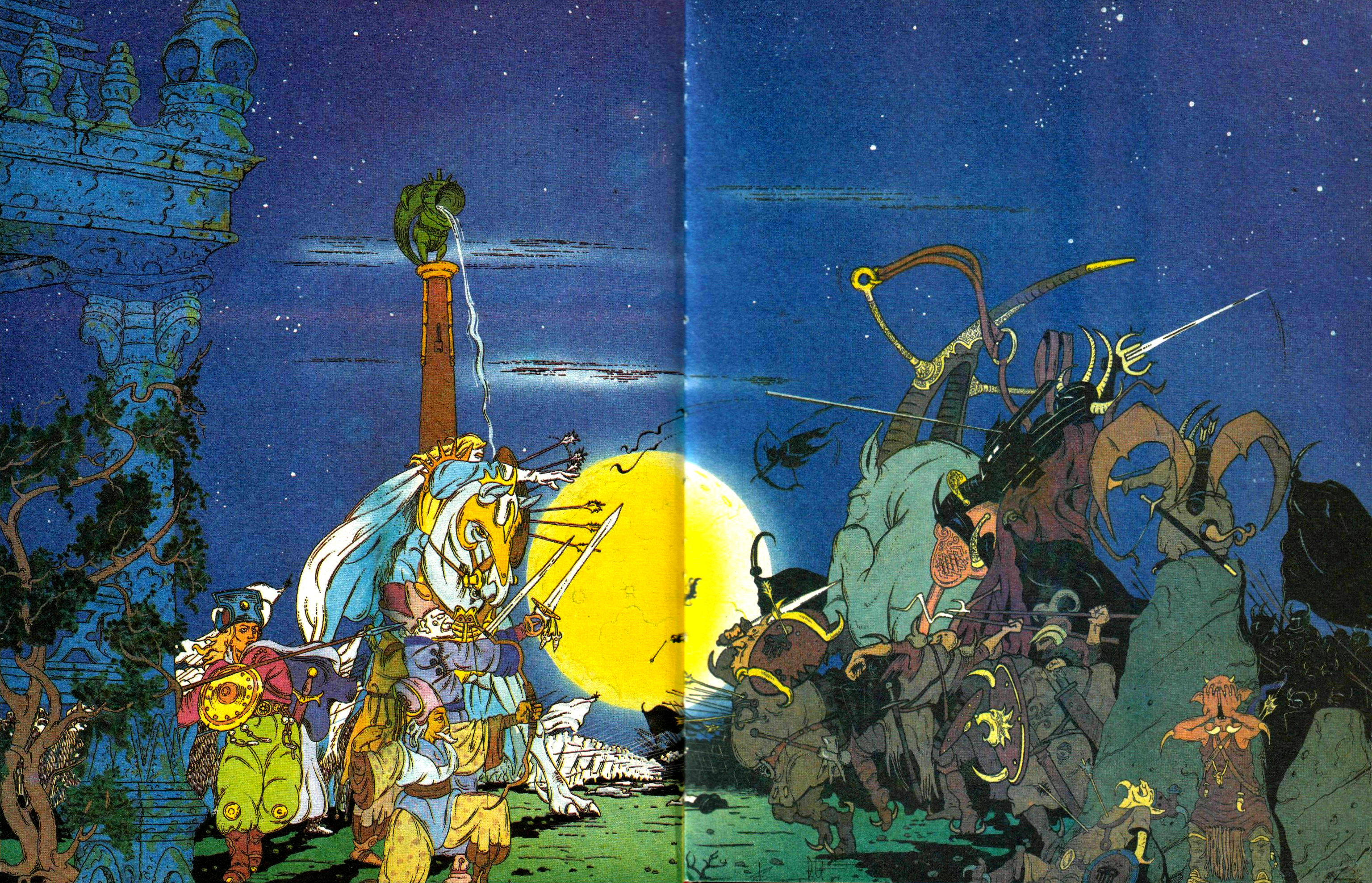
 The hectic, global nightmare of early 2020 seems like a good time to reappraise our perception of Disney, an increasingly powerful demigod in the media-saturated hellscape we live in. Outlets and organs of multiple disciplines put out breathless articles about the conglomerate’s “unprecedented” success last year. A brain-thudding stream of MCU, Star Wars, remakes, a streaming service, sequels, even the long-anticipated arrival of Kingdom Hearts III: it’s a constant content deluge that runs to hundreds of hours and billions of dollars. And this is the new standard, not a freakish exception. Disney continues to run unchecked, requisitioning more and more head- and life-space with gleeful juggernauting rapaciousness. Thus the recent-ish reappearance, in English, of How to Read Donald Duck (Para Leer Al Pato Donald) by Ariel Dorfman and Armand Mattelart, couldn’t come at a better (worse) time.
Originally published in 1971 in Chile during the brief tenure of socialist Salvador Allende and the Unidad Popular government, How to Read Donald Duck scrutinizes the sociopolitical messaging in Disney comics disseminated throughout Chile by the US. The book was first published by Editorial Quimantú, a UP-owned publishing house focused on cultivating literacy and cultural awareness with domestic rather than imported media. Quimantú produced comics of its own, including Cabro Chico and La Firme, that attempted to depict authentic Chilean experience rather than promulgate a mediated American one.
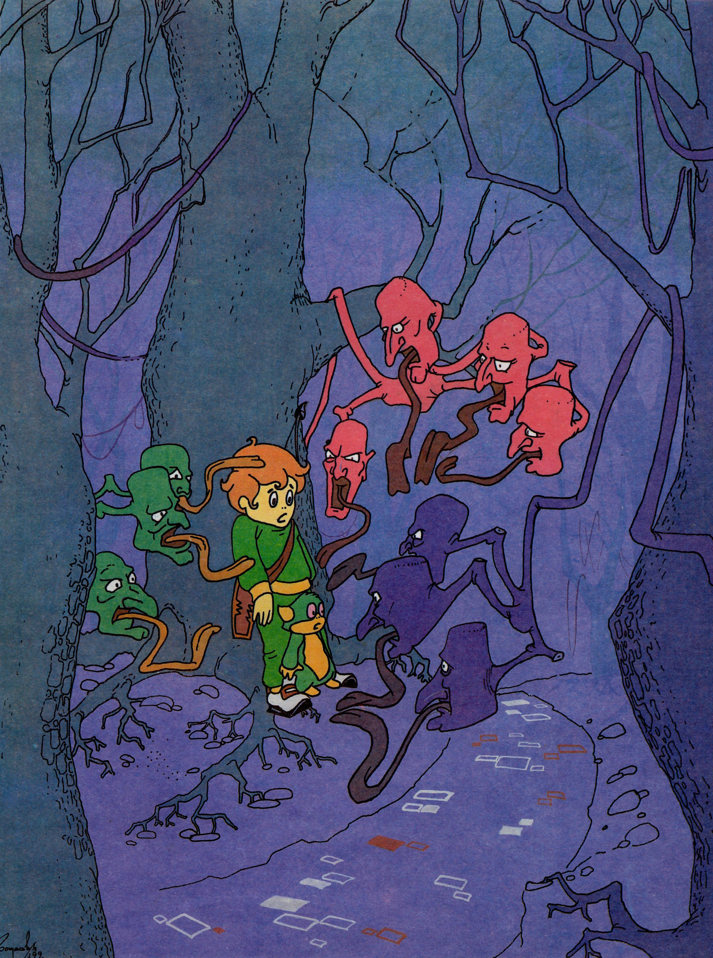
Donald Duck exposes the culture of Disney comics as a quiet inculcation of imperialist doctrine. Disney characters like Donald Duck are imprisoned in a candy-colored vision of capitalist reality: a world full of isolated individuals, unconnected from one another but endlessly kinetic, rocketing from one situation into another—into jobs, feuds, foreign countries (inevitably portrayed as backwards)—in an attempt to grasp some nebulous brass ring that, inevitably, they lose in the extended gutter between the end of one comic and the start of the next.
Dorfman and Mattelart—the former was, at the time, a cultural advisor to Allende, and the latter a Vatican-appointed demographer turned media analyst—grok the “clast” in “iconoclastic”; there’s a destructive glee in Donald Duck, a cheerful violence lobbed at Disney’s insidious, facile world, which punctures many of the hilariously inflated conceptions about Disney. The “Uncle, Buy Me a Contraceptive…” chapter, for my money, murders once and for all the Parent Question. If you’re unfamiliar, the question is: why do so many Disney characters not have parents? You can find film historians, YouTuber film critics, and general Disneyphiles somberly attributing the answer to tragedies in Walt Disney’s own life, mythological reference, and/or attempts to create independent thinkers out of children. Dorfman and Mattelart see something much more sinister:
In Disney, characters only function by virtue of a suppression of real and concrete factors; that is, their personal history, their birth and death, and their whole development in between, as they grow and change. Since they are not engendered by any biological act, Disney characters may aspire to immortality: whatever apparent, momentary sufferings are inflicted upon them in the course of their adventures, they have been liberated, at least, from the curse of the body.
A Disney character comes ready-made, optimized to function eternally in the false worlds created for him. In the comics under examination, that world is a capitalist, imperialist vacuum. Capitalism is fundamentally prudish, obsessed with order, control, regulation. Rejection of biological origin neatly eliminates the messy reality of human interdependence and community. Imperialism inherently fears being beholden to someone or something external, precisely because that’s the relationship it imposes on everything around it. So, parentless as any product, Disney characters don’t owe anybody anything. They’re free to define themselves exclusively through their actions, however hollow those actions might ultimately be. This is one example among many in this slender little fulgurant. Donald Duck is literally packed with figurative explosives of equal brisance. For six chapters, Dorfman and Mattelart keep digging and dynamiting their way through the Disney mythos. Naturally, they attack the easy targets with scholastic thoroughness and writerly aplomb: the racism, sexism, and jingoism prevalent in Disney comics. But they go far beyond that and arrive at a diagnosis of the (very contagious) American Sickness:
The threat [of the comics to Chile] derives not so much from their embodiment of the ‘American Way of Life,’ as that of the ‘American Dream of Life.’ It is the manner in which the U.S. dreams and redeems itself, then imposes that dream upon others for its own salvation, which poses the danger for the dependent countries.
That dream is one of Innocence, a vision of eternal, misremembered childhood simplicity projected by prudish, frightened, powerful adults. The American impulse careers manically toward simplicity, a reduction of everything to Good or Bad, Positive or Negative, Profit or Deficit, Winner or Loser. And as an imperialist force, when its binary worldview doesn’t map onto reality, it’s the fault of the franchisee, not the franchiser. This, Donald Duck says, is the central falsity of Disney, as dangerous as a hundred other American fantasies: the Noble Loner, the War Worth Fighting, the Good Cop.
In Chile, Disney, like the US, is an invasive species. What crosses borders as an innocent entertainment is in fact a foreign contagion working to assimilate the local hosts. This happens literally as well as figuratively. Disney comics are subcontracted to domestic printers and writers. Thus, in 1974, a year after Pinochet’s junta took over, there was this explicitly pro-violence, anti-Allende Disney comic in the Chile Monitor:

As Dorfman and Mattelart point out, the messaging isn’t always this explicit, but it extends logically from the values instilled by US-made Disney comics. As How to Read Donald Duck’s English translator David Kunzleman says, “The native contributes directly to his own colonization.”
The domestic-undomestic Disney comic is a particularly ugly metaphor for the relationship between the US and Chile in the ‘70s. It’s no secret that American interests were firmly against an Allende presidency, and it’s a safe bet that US politicking and influence at the very least exacerbated the conditions that led to the Pinochet junta. From there it’s not a very long mental walk to some umbrageous extrapolations regarding the present-day situation in Chile and the protests and struggles going on there (already forgotten by the magpie US media).
Donald Duck is a timely book for this very ugly present moment. But too, it finds universality in its particularity. In its depiction of subsumed messages in Disney comics it reveals the threat of brain colonization facing any human consuming media. To some degree, this process is inevitable, involuntary. As an adult I hate Disney, hate everything it’s ever done and all of its glittering, superficial, asinine media properties. But after decades of exposure, much of it “willing” when I was a child, some residue remains inside me that reverberates to the sterile Disney fantasy: its cleanness, its simplicity, its comfort and ease.
So, among the lessons to be found in Donald Duck are: Everything Says Something; and also: Everything Leaves a Mark. Directly and indirectly, people are shaped by what they read, watch, hear, play. Indiscriminate consumption leaves wounds, and neglecting to consider the Hows and Whys of what we take in, whether that’s the latest curlicued Disney confection or the Kojiki is, in very real ways, socially and morally irresponsible. Discriminate consumption also leaves wounds, but if we’re conscious of what we’ve consumed, if we’re vigilant about what it can do to us and others, maybe we can, somehow, become better. As it was upon its initial release, How to Read Donald Duck is an exhilarating taste of sanity in an ugly, ugly time.
OR Books released How to Read Donald Duck in 2018 for first time in the US since the original 1975 edition was seized by Customs at the behest of Disney. It includes a new introduction by Ariel Dorfman in addition to the original preface to the English edition by Dorfman and Mattelart, as well as the introduction to the English edition by David Kunzleman. As mentioned above, Kunzleman did the English translation and it is excellent. A new appendix includes a piece by John Shelton Lawrence called “Donald Duck vs. Chilean Socialism: A Fair Use Exchange,” which is also well worth reading.
![]() Ben Schwartz is a freelance writer working out of Ohio.
Ben Schwartz is a freelance writer working out of Ohio.